Playing with New Design
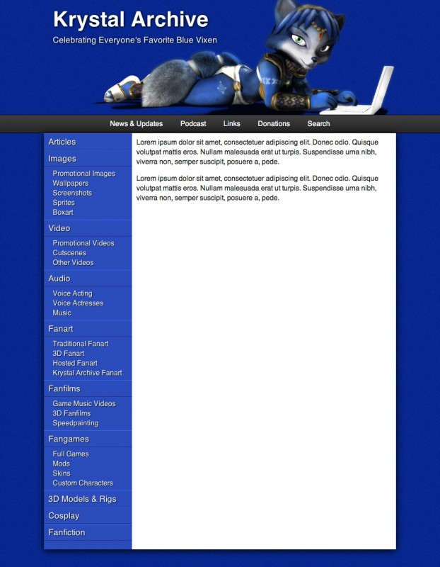
I'm working on a new theme for version 4 of the Krystal Archive. The new theme will focus on simplification of the visual style, the site design itself, and the content design so that people that other myself will be able to help maintain the Krystal Archive. Take a look, and tell me what you think. The image of Krystal was specially rendered for the Krystal Archive version 4 by Greyfirefox.
Edit
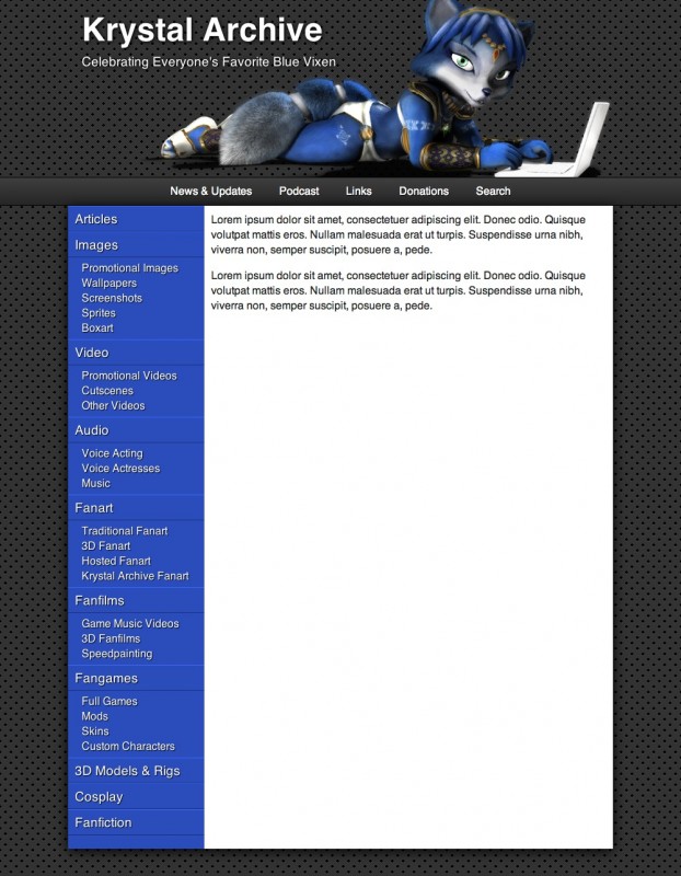
The first comments I've received on the above design called for a background image. The above image does have a subtle background in the form of noise (like the previous version 3.5 of the site). So far, commenters want a large, Krystal-centric background image, which is probably not going to happen due to the inherent limitations of such backgrounds (see comments), and the fact that this site expands and contracts its size based on the width of the browser window (and in the future, will adapt to mobile devices). I am not opposed to a more agressive, repeating, small background image though. Here's the site with some of the background imagery from the Saurian Translator. I think it works pretty well here, but tell me what you think.


Comments
Quite nicely, but is it possible to replace the blue background? Maybe put some texture in there.
What sort of background would be good? Grey?
no no no, i mean put there some picture on the background, not just the blue color.
(Sorry for my english.)
I have created one of my vision of KA 4.0
Here, take a look
(http://immagetest.ucoz.ru/image3-kopija.jpg)
But this is only beta, i try to make something better. when i will have a little more free time :)
Everything find but background. Well, I did some of the design just click the link below.
http://imageshack.us/photo/my-images/818/kadesign2knop64.jpg/
What do you think?
I can make other one and different.
Ok, so you basically want more Krystal in the background. While I understand this, here’s the problem:
1. Such a large background image is going to add significantly to the page load time (the top image that is there now is too large and will be optimized to a smaller filesize in the final version).
2. Overly complex backgrounds, particularly characters or people, serve to distract the viewer from the main focus: the actual content of the page (stuff that will go in the white area).
3. How would such a large background image be managed? Would it be repeating vertically, would it only appear once at the top? The KA has long pages, so if it was only at the top, any background would not be seen for most of the page.
Here you’ve added a bunch of colors that are completely irrelevant to the page. Everything else in the page is blue, white, grey, or black. Your swirls of green, red, and yellow are completely out of place. Additionally, all the problems with I’d_like_to_stay_incognito’s design also apply to yours.
Ok, so check this out-
(http://immagetest.ucoz.ru/Image5.jpg)
(+)
– Background now can be repeated all over and over again. (In the picture of the site you can see only the half of the background)
– Now we have only 1 Krystal on top) (Making progress so far :-7 ) and i put only eyes
(maybe that becouse her eyes is beautiful, you can’t disagree with that :D )
PS
and sorry, i just read that addition for this topic. Yes, new background looks cool :) And about mobile version of the site… that very VERY COOL :)
That’s a nice one!!!(second design) ^.^
I really like both of ur designs mr.k (if that’s ur name everyone uses, just found this site like 2 days ago) the second design posted by incognito was good too…. I actually like the grey one u did, but the second one incognito did a little better :)
Any way you do the background, Blue or Gray, it looks great Mr. K!
Can’t wait for the site to be back together again! :)
I totally love the dark theme better then the blue theme! The dark theme looks clean cut and cool!